
EA Sports logo evolution

EA Sports is a subsidiary of Electronic Arts that created and publishes video games such as FIFA, Madden NFL, EA Sports MMA, Fight Night and NBA Live. With out a doubt, at the beginning of all of these games you will see an animated ‘EA logo. Regardless on the logo currently having a modern feel to it, there were several changes made over the years.
EA Sports first logo 1991-1993
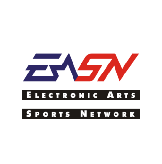
EA Sports actually tried to imitate real-life sports networks by using a marketing gimmick and calling themselves ‘Electronic Arts Sports Network’/ EASN (sounds familiar?) The logo design they had used was a word mark which consisted of 4 letters ‘EASN’, the two horizontal lines of text placed underneath ‘Electronic Arts Sports Network’.The combination of the word mark and the text certainly does look awkwardly positioned, along with an amateurish typeface pairing. The word mark its self is not so bad, as it has a combination of geometric shapes; triangles and rectangles. This enables the word mark to form a simple silhouette. The simplicity of the shapes used enable the functionality of the logo as it can still be recognised/ used in black and white. However, the small and awkward text below the logo can restrict how the logo is used on marketing products, such as horizontal banners, caps, game covers etc.
EA Sports second logo 1993-2000

EA Sports moved away from gimmick by removing the ‘SN’ from their word mark. The word ‘SPORTS’ was then placed at the bottom instead, which meant the previous text below the logo was removed. This decision lead to a more cleaner approach for the logo design, as the word mark now looked more unified with the text. The letters ‘EA’ was also made bolder which gave it a modern aesthetic.
EA Sports 3rd logo 2000 - 2005

In 2000, EA made the best decision to their logo by simplifying it further. The previous ‘A’ letter, may have been hard to read for those who weren’t familiar with the company. The letter looked as if it were to be a star symbol, combined with the letter ‘A’. It wasn’t completely functional since legibility is number 1 priority when creating any form of word/letter mark. These simple two letters have now become a recognisable, iconic logo mark due to its simple, memorable and appropriate form.
EA Sports 4th, 5th, 6th & 7th logo 2005 - present
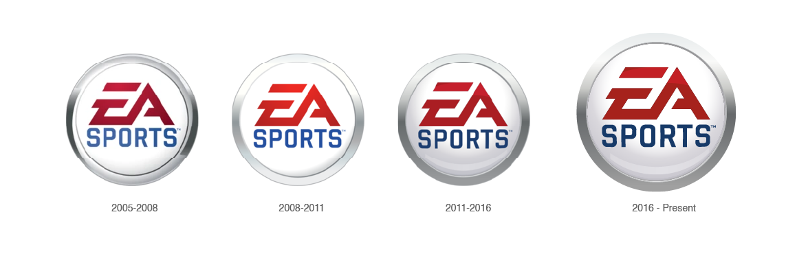
It seems that EA had found a timeless logo design they could use for many years to come. EA is still using their badge like design. This definitely makes sense as it is another solution to unify the logo to the logotype. Since 2005, EA had not changed the main components of their logo. Despite colour, only element changed is the bevel design on the badge. As the years progress, it is noticeable that EA Sports are using a more 2D design rather than 3D, as each badge gets increasingly flat. The Logo can also be used in a simple monochromatic colour, which looks incredibly modern.

Overall, EA Sports had used a handful of logos through out the years, but there wasn’t that significant changes. Noticeably in the early years, EA Sports had gone for a more trendy logo as they started using a similar name to ESPN. They also incorporated shapes such as stars in their logo which made the logo harder to read. They then Made the logo more unified by adjusting the type/ text below the logo. This then lead to EA simplifying further and making the ‘EA’ logo mark completely legible by removing the awkward star. EA then added a badge emblem to the design as well as incorpporating gradients, but then reduced the 3D effect as the years progress, increasing the modern aesthetic of the logo. EA Sports today has a good logo as it is simple, appropriate and recongniseable.