
Logos that need redesigns
Whether a logo design has been used for many years, it doesn’t necessarily mean it is a good logo.
We have seen many logos that have been redesigned such as; Dominos, Animal Planet, Skill Share, Startbucks, and the ever so famous Gap logo.
Here is a list of companies that may need to consider redesigning their logo design.
Pepsi
The Pepsi logo design is a simple, clean and abstract mark. It also has the elements of a good logo (Find out what makes a good logo here). Pepsi has a history of ‘not so great’ logo designs, from 1898, to 1962. After these years, the company had started to adopt a more minimal abstract logo mark based around a circle with a ‘wave’ like element.
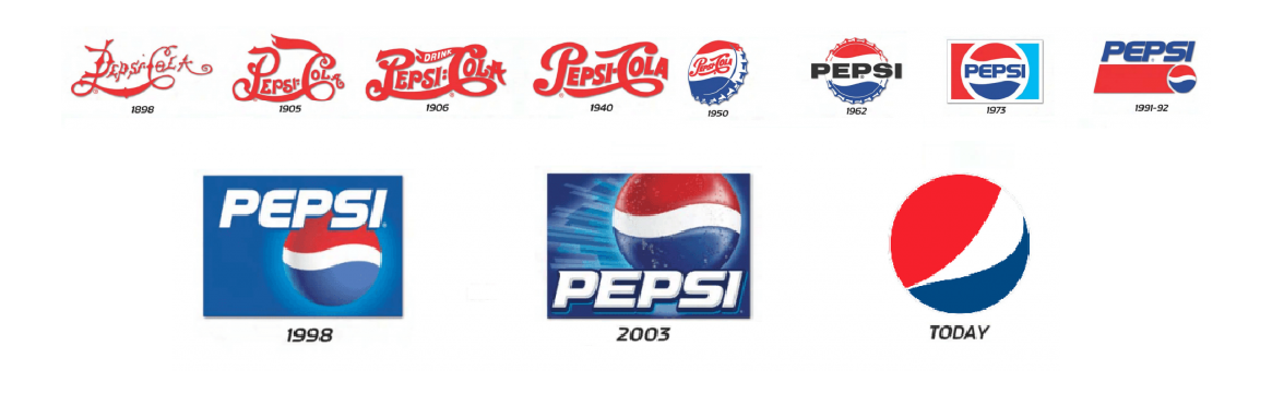
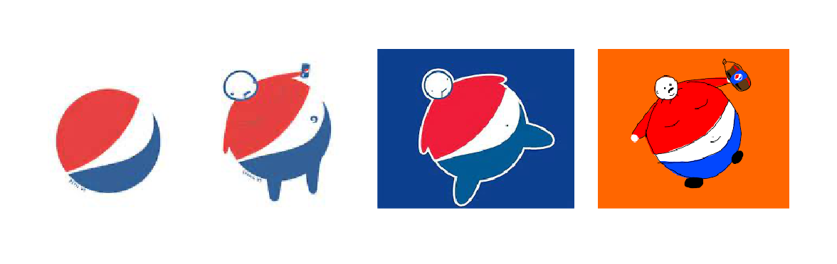
Despite the progress that Pepsi have made with their logo design, the world can be quite unforgiving when opportunities arise. The current Pepsi logo is indeed abstract, but yet people find a way to turn it into something somewhat funny…
The popular image of the logo turned into a man who is overweight and rolling on his side can be found everywhere on the internet. This imagery is an indication of what the drink can do to you. Once seen, it’s very hard to ‘un-see’ whenever you next set your eyes on the Pepsi logo.
The sad truth is that no one want’s to be made fun of, not even a logo. Pepsi may wan’t consider redesigning their logo as it does have potential of pushing customers away, whether the logo is intentional or not.
Pepsi’s abstract mark was executed extremely well. Maybe staying on this path is the right way, but just crafting an abstract symbol that does allow opportunity to represent anything else.
Watch me redesign the Pepsi logo
Click the image to watch FrescoFriday - Pepsi logo redesign
British Airways
British Airways is one of the worlds best known airlines, and is the second largest British airline just behind easyJet. the airline is also a founding member of the worlds OneWorld airline alliance. The company has a great history, tracing back to the early years of aviation.
With a history of British Airways, it is quite common for a logo design to hold so much value which has been built over several decades. Their current logo was designed back in 1997 by Newell & Sorell. The logo is a symbolisation of speed, and a soring bird, in the form of a ribbon.
The British Airways logo design is a great piece of design, due to the minimal use of rectangular shapes forming a ribbon. The logo is very functional when its used on planes. The very wide logo mark uses the space on a plane perfectly also having a similar shape to the plane.
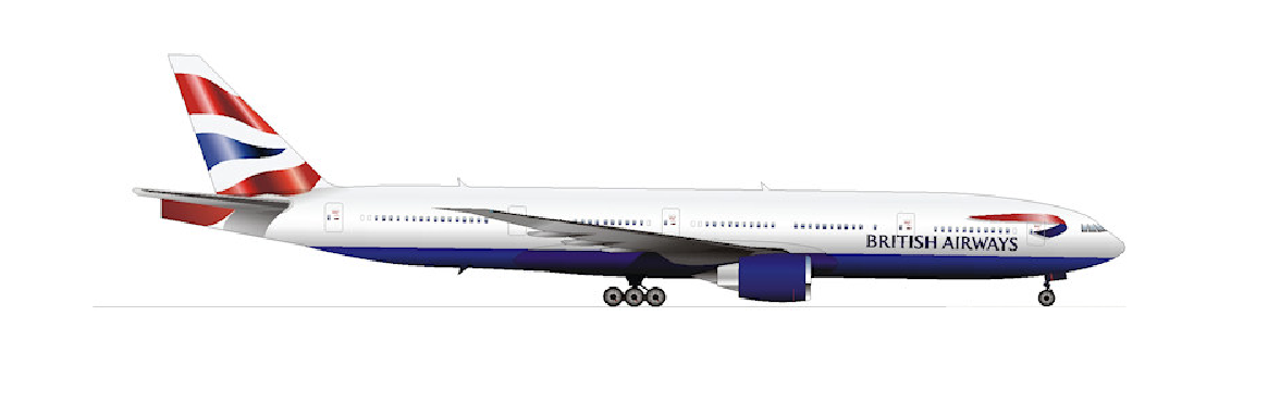
Although the logo design is very functional on the plane, there may be limits when it comes to using the logo design in other places. The world today is way more digital than in the past. Considering how a logo design can be used as an icon when creating the logo is extremely important, and obviously may not have been considered when creating the British Airways logo.
Fitting a logo in an even square is good practice for creating timeless and powerful logo designs. The British Airway logo, typically takes up 3 squares instead of one, also with un even sides. This maybe difficult to be used as mobile app icons, favicon and social display pictures.
A redesign of this logo may be needed to keep up with the world today, possibly solving the problem of fitting such a wide ribbon, in a even sided square.
Watch me redesign the British Airways logo
Click the image to watch FrescoFriday - British Airways logo redesign
Cadillac
The Cadillac brand has been a house hold name for many years. When it first began, there was a main focus on the quality go the cars that they produced. The word ‘Cadillac’ became such a strong brand that it was used as and adjective. For example, “Gucci is the Cadillac of designer clothing”.

Despite Cadillac having so much success over the years, they have a unique logo design that consists of a variety of squares and rectangles. Although geometric shapes are used within the logo design, does it pass the line as a good logo design? A good logo design typically involves a logo design being memorable and easily drawn out after a 5 second glance.
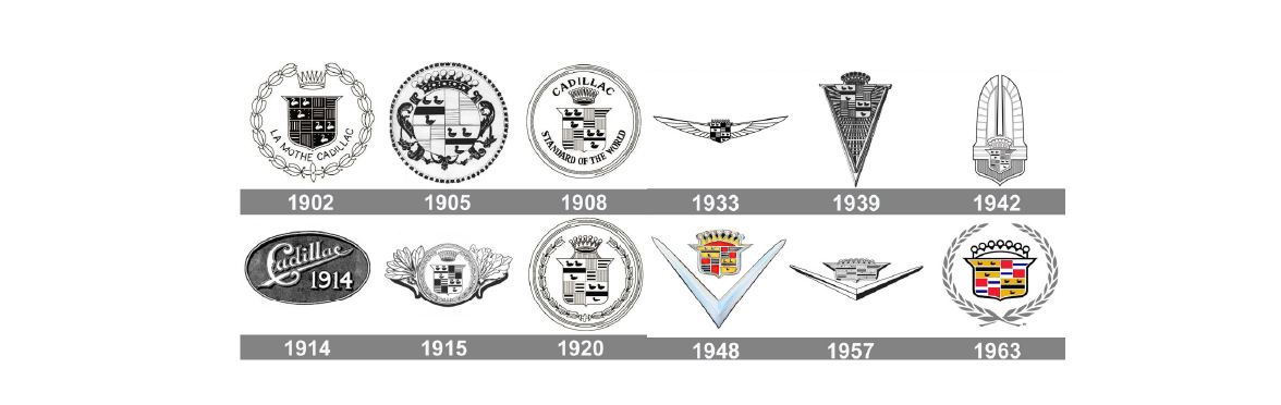
I challenge you to have a glance at the logo for 5 seconds, turn away, and try to re-draw it…
The chances of you succeeding in doing so are very slim. However, logos such as Apple, Nike, and Target, would give you much greater success if you was to do the same with these logos.
The outer badge/ shield, that accompanies the Cadillac logo is a great container for the shapes, but adds another element within the confusion, making it hard to memorise.
A consideration of a logo redesign Is nessecary for Cadillac. They have changed ther’re logo many times through out the years also keeping a similar aesthetic. Redesigning the logo but yet keeping true to their roots is certainly accomplishable.
Watch me redesign the Cadillac logo

Click the image to watch FrescoFriday - Cadillac logo redesign
Join Me Live On Fridays: FrescoFriday - Logo Re-Design
Behance Live 19:00 GMT - Behance Videos/ Live Steam