Most unique logo designers on Instagram
The design community on Instagram is excellent. Always open for conversations , feedback and willingness to share your work with their following. However, there is a lot of noise on the platform with hundreds of designs, good and bad being posted/ reposted by anyone and everyone.
If your a logo designer that uses instagram for inspiration, look no further. I’ve put together a short list that contains logo design specialists who produce unique, timeless and striking logo designs on a daily basis.
Please note, this post is subject to be updated monthly.
@allanpeters
Allan Peters never fails when creating bold, ageless and striking logo marks. A style that consists of a combination of thick lines and shapes, resembles another great logo designer; Aaron James Draplin. Allans flawless logo designs always remain simple and yet impactful regardless on the brand. Each logo produced is perfectly crafted with seemingly no effort.
Although this style of logo design looks easy, many logo designers that try to replicate Allan’s style, fail. A very good balance of positive and negative space within each logo design whether it’s word marks, combination marks or badges. With a world class approach, Allan is able to produce timeless and effective logo badges that are coherent to the brand.
Work by @allanpeters


@Kostadin_ov
Logo designs that are presented in black and white are extremely impactful, as it shows great evidence of possessing the ‘timeless’ attribute. World class logo designs are typically those with a minimal and straightforward approach to solving a problem. Clean and ageless logo designs such as Kostadin, date back to the 1960’s.
Kostadin has a great collection of logo marks that seem as if they are from a world class logo design book. Kostadin has the ability to create logos with a variety of techniques. Whether it’s halftone, cut-off, 3D or effect, Kostadin never fails on producing outstanding logo marks.

Work by @Kostadin_ov


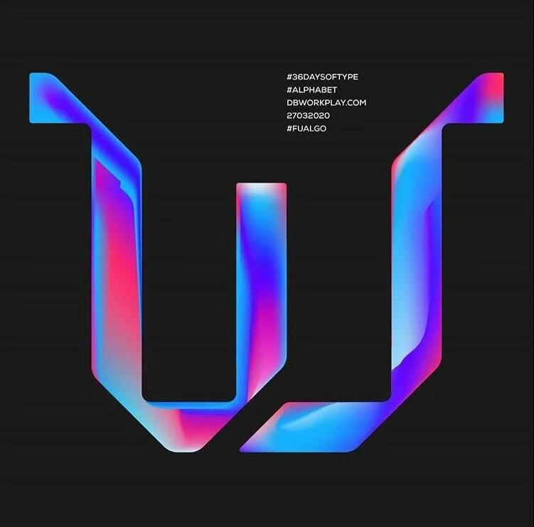
@Dbworkplay
Davor Butorac is a self-taught graphic designer who specialises in logo and brand identity design. Davor’s Instagram page caught my attention when I came across his work as a repost on one of the logo pages. His work stood out amongst many of the reposts as he carries out a particular technique when developing logos.
As I myself are a reader of logo books such as Logo Modernism by Jens Muller and Wiedermann (Ed,), this book contains a variety of logo design styles done in previous years. The logo design style ‘Cut-off’, is one of my favourites as it gives a futuristic but yet timeless feel at the same time. The style also provides an element of surprise as not many designers use the technique, but executed well it has a great impression.

Work by @dbworkplay

@Steveraboin
Steve Raboin is an award winning designer and the founder of Raboin Design Company. I came across Raboin on Instagram when he had approximately 15k followers. After following him, I found every single one of his posts to be a very strong piece of design.
His style consists of simple of bold shapes, creating various types of logos such as monograms, letter marks and badges. Raboin style is really timeless as I can see similarities with logo designs created in the 1960’ which consists of bold letter marks and monograms. Many designers produce these type of logos on Instagram but Steve Raboin is very skilled and knows exactly how to execute it very well.
Work by @steveraboin

@the_monochromatic_institute
The Monochromatic Institute is a remarkable page. I was able to witness the page grow rapidly by consistently posting strong work. This page has excellent logo design content that is posted in white on black. This colour scheme brings out the elegance of each logo design even though it is only in black/white.
The use of the black and white highlights the beauty in simplicity when designing a logo. With out a doubt, each logo design posted on this page will be able to stand the test against time for years to come. Similar logos have also been executed in the 1960’s and are very much relevant today.

Work by @the_monochromatic_institue

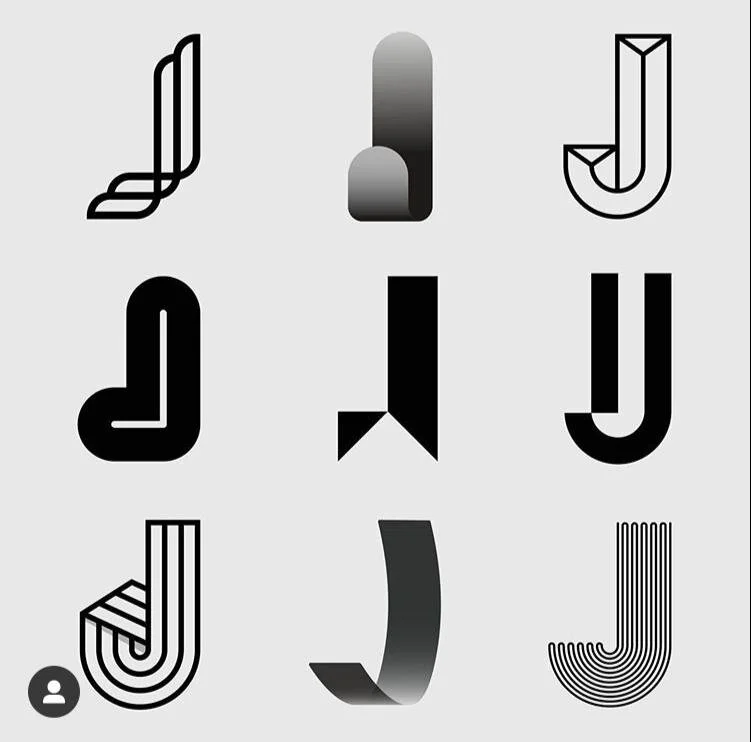
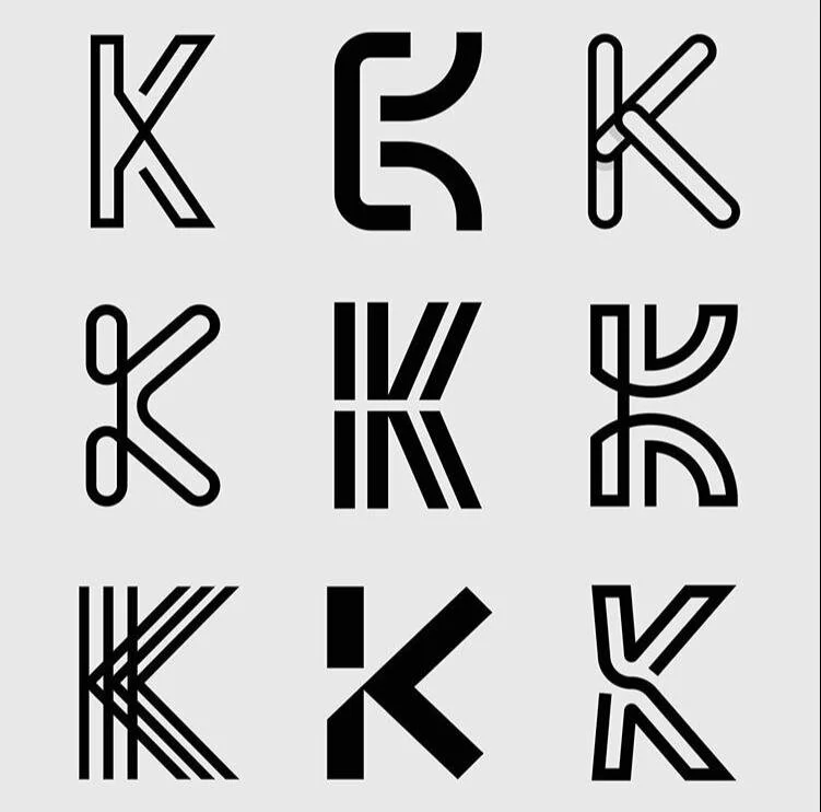
@timiedesign
A logo and brand identity designer based in Dublin, Ireland. I came across Timie’s work on my explore page, and immediately clicked on the post. When I first started to use grids for my logo design it changes the style of my logos positively and made my work more precise. Timie’s work is really simple, clean and timeless and has a noticeable style, which involves the use of lines ranging from different weights, thick and thin. The technique used is similar to the logos designed in the 1970’s, known as ‘Line’ (referencing Logo modernism).
Work by @timiedesign