
What I Learned from 18 Behance Features - Design Awards
Seven years ago, I became obsessed—not just with logo and identity design, but with Behance.
Behance was (and still is) one of the best places to discover world-class visual identity work. I would spend hours studying the most awarded pages, looking for patterns.
When I transitioned to freelancing and had more time, I dug even deeper.
At first, I thought it was just about the quality of the logos themselves.
But the deeper I looked, the more I realized:
It wasn’t just the work—it was how the work was presented.
Presentation mattered as much, if not more, than the craftsmanship itself.
This realization changed everything for me—not just how I posted work online, but how I presented ideas to clients, priced my services, and built my reputation.
After winning 18 Behance awards across logo and identity projects, and even being invited onto the No.1 Logo Design Podcast LogoGeek (listen here if you haven’t yet), I can confidently share what truly matters.
And it’s not what you think.
Key Takeaways
Presentation amplifies perception—and perception drives value.
Behance awards aren’t purely about craft; they’re a reflection of presentation excellence.
Storytelling, precision, and packaging are the real levers.
A polished perception allows you to charge higher prices and win better opportunities.
Presentation isn’t vanity—it’s a strategic tool for career growth.
The Halo Effect: The Power of Presentation
I’ll never forget the first time I walked into a Mercedes-Benz dealership.
The moment I stepped inside, everything shifted.
The red carpet. The polished floors. The lighting that made every car look like a masterpiece. Even the scent in the air felt premium.
Instantly, I felt different. A little intimidated. Like I didn’t quite belong.
When I sat inside the car I was considering, I found myself making excuses not to buy it—not because of the car itself, but because the entire experience overwhelmed me.
That moment taught me something crucial:
Presentation creates perception.
Before a single feature is tested, before a product is even touched, your mind has already decided its value—based purely on how it’s presented.
This is the Halo Effect in play:
When one strong impression—like luxury, craftsmanship, or exclusivity—colors your judgment about everything else.
Because the dealership looked and felt premium, I assumed the cars were premium. Because the environment was intimidating, I assumed ownership would be too.
Presentation doesn’t just reflect value—it creates it.
And in design, it’s no different.
It’s not just what you create that matters.
It’s how you present it that shapes how the world receives it—and what opportunities open up because of it.
What Really Wins on Behance (and Beyond)
After years of studying and winning awards, I broke it down into three essentials:
1. Story
How you visually tell the journey.
Showing how you got from A to B.
Making the viewer feel like they understand the why behind every design choice.
2. Precision
Honoring craftsmanship.
Showcasing the details that separate good work from great work.
Every alignment, every curve, every execution matters.
3. Presentation
Packaging the work as premium and intentional.
Clean layouts, purposeful mockups, thoughtful pacing.
Making the project feel important, not disposable.
If you want actionable steps on how to maximize your chances of being featured, check out my blog post: How to Get Featured on Behance.
Why Presentation = Opportunity
In today’s landscape, designers are everywhere.
It’s easier than ever to post projects online.
But with so many visuals flooding the feed, what stands out isn’t just the work—it’s the presentation of the work.
I’ll be honest:
Some of my award-winning logos are extremely minimal.
Sometimes just a circle and a semi-circle.
It’s not because the symbol itself was groundbreaking.
It’s because I presented it intentionally, as if it was a masterpiece.
The reality is:
Craft is non-negotiable—you must still master your skills and put in the 10,000 hours.
Presentation amplifies that craft—and often decides if your work gets noticed, shared, or celebrated.
The Designer’s Currency at Play: Time, Money & Energy
The more time, money, and energy you invest in your presentation, the higher your perceived value.
The higher your perceived value:
The more “yes” moments you get from clients.
The fewer revisions and resistance cycles you face.
The more recognition you attract.
The higher prices you can charge.
The more opportunities you create.
How does this investment look in practice?
Time:
When you save time by being efficient during the creation phase, you can reinvest that saved time into polishing your presentation—without guilt of not spending as much time as ‘normal’ on the project.
Imagine spending less time creating and more time presenting, and hearing your client say:
“This is the most beautiful presentation I’ve ever seen.”
You won’t feel bad that you worked smarter—you’ll feel proud of your creative clarity, and feel like you are a natural born, talented designer.
Money:
Money spent wisely can accelerate your presentation quality.
That might mean investing in better tools, resources, mockups—or even outsourcing case study design to those who are really good at project presentations.
I personally believe this is a craft in itself.
Energy:
It takes real mental effort to craft a coherent, compelling visual story.
Study award-winning projects, dissect how they sequence information, and apply that same storytelling arc to your work.
Remember:
Presentation isn’t the “extra”—it’s the multiplier.
The Presentation-Perception Graph
I call it The Presentation-Perception Graph:
Higher Time, Money & Energy invested in Presentation = Higher Perceived Value
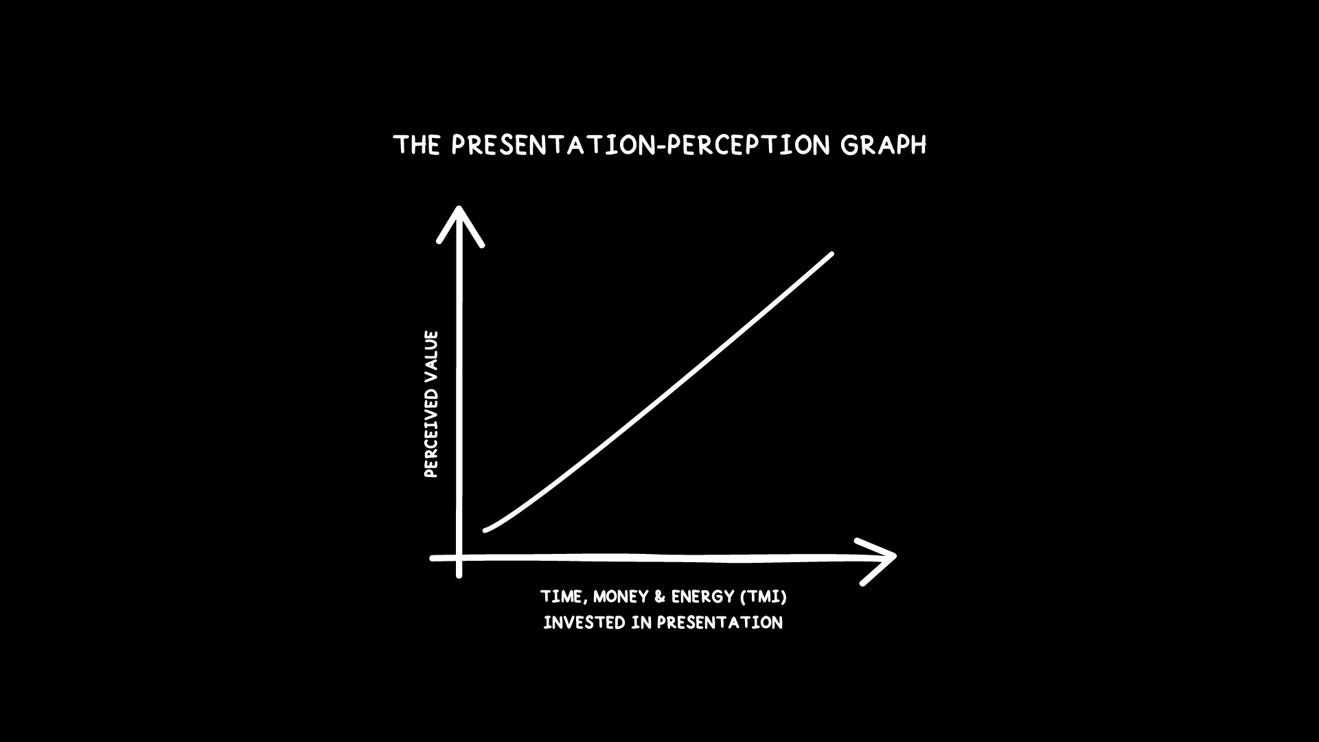
The Presentation-Pereception Graph
This simple relationship can change everything about how you approach your projects and portfolio as a designer.
Being a Lean Logo Designer Means Working Smarter
Being a Lean Logo Designer isn’t just about being faster.
It’s about focusing your time, money, and energy where they make the most impact.
Deliberate focus on how you package your work leads to:
More client “yes” moments
Less resistance and revision cycles
More recognition
Higher perceived value—and higher prices
Because perception is reality in design.
You could have created the best logo in the world—but if it’s poorly presented, it won’t be seen, respected, or valued.
Conclusion
Behance awards once felt like the highest honor.
Now, I see them differently.
They’re not a badge of pure skill—they’re a result of strategic storytelling, craftsmanship, and presentation.
Winning awards, winning clients, charging higher rates—it all traces back to one core principle:
How you present your work matters.
Protect your time, energy, and money—and place your effort where it makes the biggest impact.
Because in the end, it’s not just about logos.
It’s about how you deliver them.
How much focus do you put into presenting your work?
Perfect your logo lockups with Logo Grids Script Pack™ for Adobe Illustrator